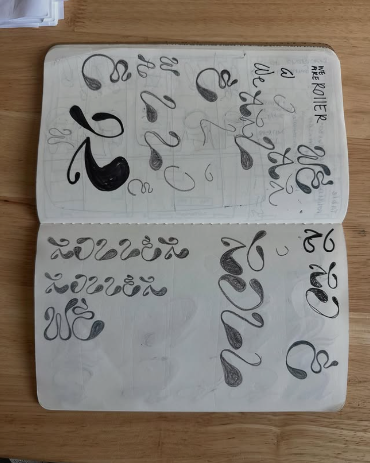
we are roller rework
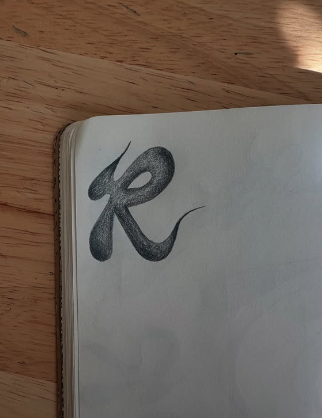
I was approached to help refine We Are Rollers’ existing logo, with a clear goal of developing a strong, versatile “R” mark. The letter itself offered a lot of potential, especially as a secondary logo that could stand alone across applications, which made the project exciting to explore.
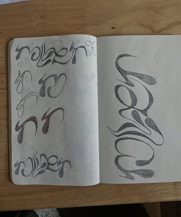
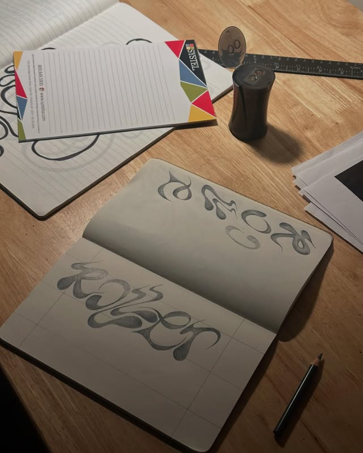
After reviewing the brand’s references and inspiration, it became clear that while the desire for a bold “R” was strong, there was limited clarity around overall direction beyond that core idea. I explored a wide range of hand-drawn iterations focused on strength, balance, and adaptability, several of which are shown below.
Ultimately, the brand decided to pause the project until they had a clearer sense of their direction. I chose to include these sketches because they represent a meaningful part of the iterative design process and highlight the exploration, experimentation, and problem-solving that go into logo development, even when a final mark is not selected.
logo designer